Services
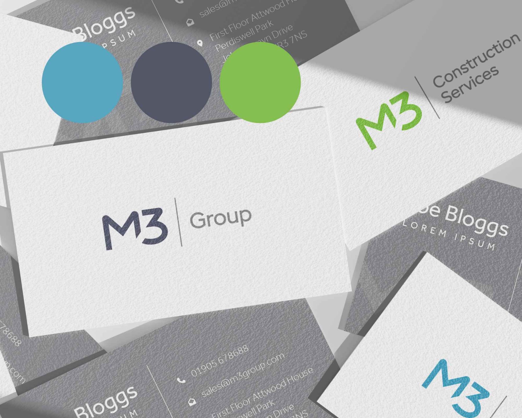
M3 Group
M3 Group required a unified brand structure to bring together M3 Floodtec and M3 Fenestration, while allowing the business to expand into new areas of the construction industry. The goal was to create a consistent, professional identity that enabled sub-brands to share brand equity, removing the need for sales teams to explain M3’s reputation in the flood prevention sector.
Each sub-brand targets a distinct audience. M3 Floodtec focuses on funders and insurers supporting property flood resilience, where clarity, speed, and trust are critical. M3 Fenestration targets developers and contractors seeking long-term partnerships, valuing reliability, sustainability, and proven performance.
We delivered a branded house model with M3 Group as the primary brand, renaming M3 Fenestration to M3 Construction Services to better reflect its scope. A refined M3 logomark, distinct sub-brand colour palettes, and clear brand guidelines were created, with website redesigns now underway for the group and its sub-brands.
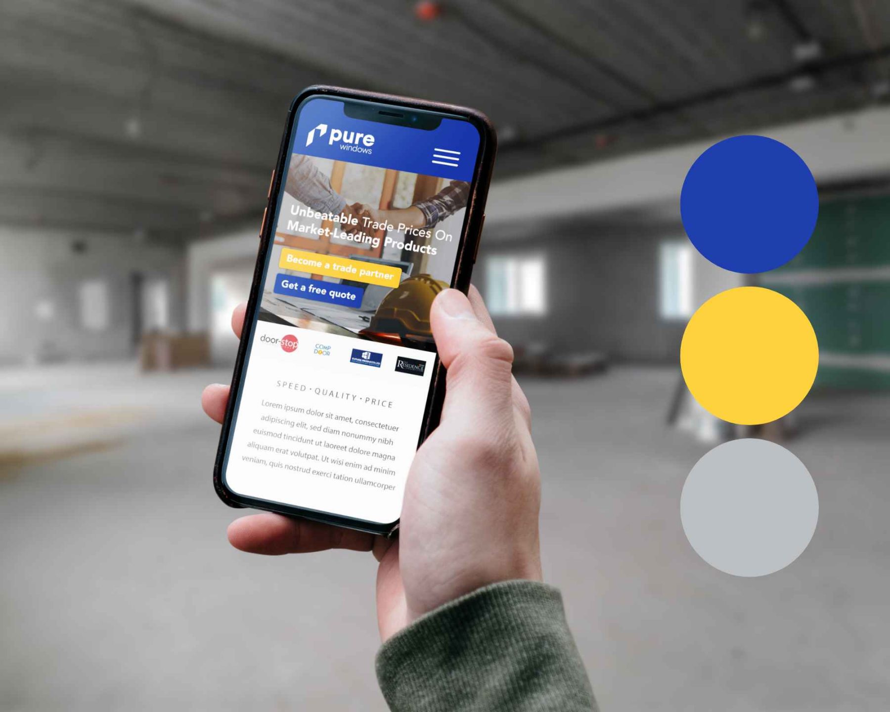
Pure Aluminium
Pure Aluminium needed a brand that mirrored the precision and quality of their fabrication work. Through strategic identity design and consistent visual language, we helped elevate their presence — making their brand as premium as their products.
In this case, we were creating and launching a brand-new brand from scratch, so our Graphic Design team worked closely with the client to create the look and feel that they wanted, showcasing their premier products, stand-out service and helping them to rise above the rest in a competitive marketplace.
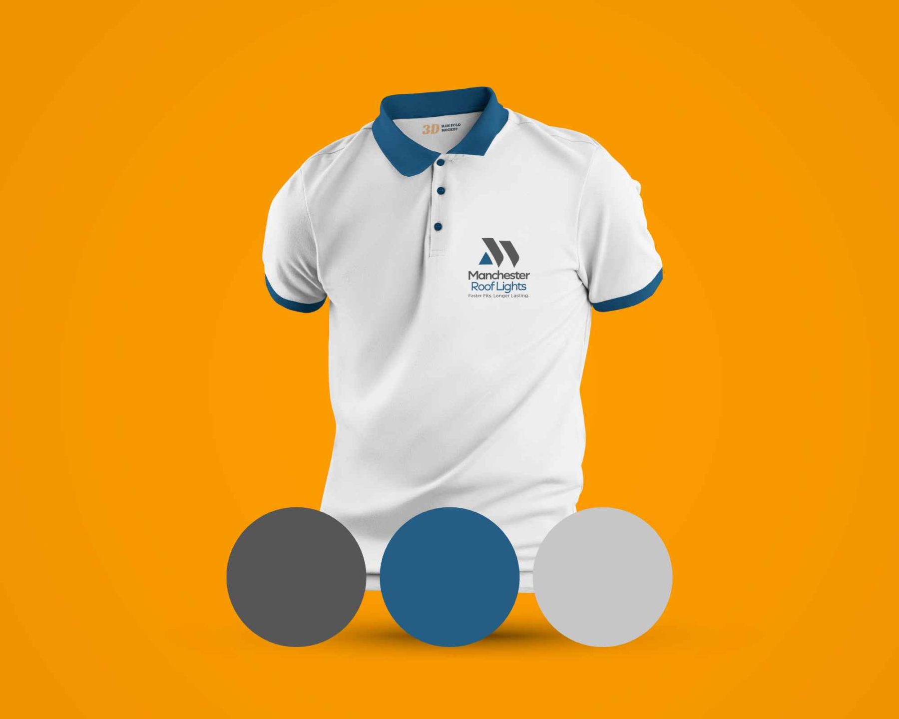
Manchester Rooflights
In a market where choice is abundant, Manchester Rooflights leveraged branding to differentiate. They approached us looking to refine and professionalise their brand identity for a trade-focused audience within the roofing and fenestration industry.
We were tasked with creating a bold, approachable and recognisable logo that would appeal specifically to builders and trade partners by communicating Manchester Rooflights’ reliability, trustworthiness and supportive services through branding that would feel both modern and practical.
To achieve this, we developed a flexible, modular logo system built around a strong central icon and a consistent typographic hierarchy. At the heart of the brand is a distinctive abstract symbol, inspired by rooflines and architectural angles, conveying direction, movement and installation flow. We paired the icon with a clean, modern sans-serif typeface and a strong blue accent.
By switching the colour accent from blue to orange, we were able to extend the brand and create an additional logo to Manchester Commercial Aluminium, achieving instant brand power across divisions and consistent messaging through multiple markets with branding that’s uniform, professional and coherent.